What is Cardboard Couture, you ask? Excellent question. We’ve mentioned before on the podcast that Mark works in animation and that I am a sometimes Communications Manager, sometimes Pretentious Photographer. We love hockey cards, but we also love the right things done in the right way. We hate ugly cardboard and can’t stand lazy designs! To balance this, we also understand that Upper Deck can’t control what players enter the NHL and when, so all they can do is make the cards they think people will want to buy.
We love a good laugh, but we were genuinely curious: have Young Guns gotten better or worse? Were things as questionable or mind-blowing as we remember? And you’re right, of course: maybe they all looked amazing in their day and were the right cards at the right time. In the end, we don’t care! We’ll cancel a graphic designer on a Tuesday afternoon.
10 Years of Young Guns Designs Ranked
The last decade has seen some of the greatest, most sought-after Young Guns ever made. Some more than others. For the sake of this conversation I’m ignoring Canvas, High Gloss, Retro, Exclusive and Deluxe. I’m all about that base! Which is something I’ll never say again, you have my word.
Here are the last 10 Young Gun designs ranked from worst to best. Enjoy!
#10 2022/23 “We Put Some Glow On Your Glow So You Can Glow While You Glow.”

Yet another example of Upper Deck choosing a white fade/glow over learning how transitions work. Somewhere Mark just got cold and doesn’t understand why.
2022/23 doesn’t make me angry, it just… doesn’t do anything for me. Also, what is the image underneath? CG molecules? An AI flower? I have no idea.
It says a lot when the worst YG template of the last 10 years is more confusing than terrible. It’s a design that you don’t care about until you stare at it, and only then you’re sort of… not hungry anymore, and you just want to get to bed early. Start tomorrow fresh.
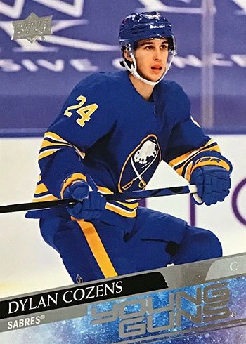
#9 2021/22 “The Base Card Equivalent Of Setting 8 Alarms On Your Phone.”
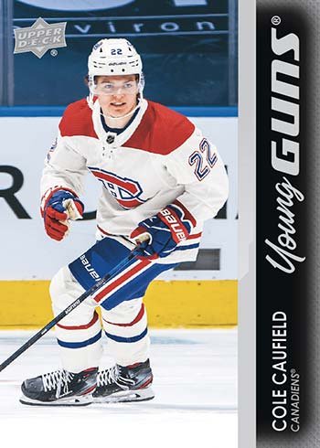
I want to be very clear about this: I like this design. The vertical bar has always been a thing and 2008/09 was what it was, but what was this a reaction to? 2020/21 was excellent, so maybe they wanted to veer of course and be different? It’s a fine reason.
This design is a black bar, a slightly smaller silver bar, and silver text. If you don’t try to do anything, can anything go wrong?
So! Full marks for cleanliness, and minimalism, and I am going to get me a Caufield at some point, so help me god! But there is nothing to see here.
#8 2023/24 “The Stars Of Tomorrow On The Cardboard Of Yesterday.”
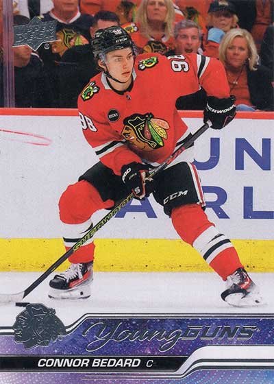
Soon you’ll see 2020/21 which is truly excellent. This feels like the same designer using a rejected variation – UD loves a good parallel! – with the same space theme, colour palette, and foil.
We aren’t sure if they wanted to make the best possible layout knowing it’s Bedard Time, or if they knew it was Bedard Time and realized nothing they did was going to effect sales.
Do you like this design, or do you just like Bedard? Bedard: the YG you can buy now because PSA 9 and below have dropped to 1/5th of the launch price on eBay. Diamond hands!
#7 2019/20 “A Monument to Compromise.”
This card is fine. Fine enough, certainly.
They say that to a man with a hammer, every problem is a nail. And, while I like my clichés to be clever, fuck me this is depressing. I honestly believe, real talk, that someone in the UD art department got really good with transparency and gradients and so we have to see that design in every. fucking. series.
Don’t get me wrong, I’ll sleep on a bed of Jack Hughes and Nick Suzuki YGs and I’ll dream happy dreams, but this year needed one last pass and some peer review.
Quinn Hughes, so hot right now.
#6 2024/25 “I Think That Year Had Young Guns.” “Sure Grampa, Lets Get You Back To Bed.”
Not great, but not bad either.
I like that all the text is legible and all the shades of grey/silver compliment each other. Does it look like a bunch of knives cutting across the card? Maybe. But if you don’t overthink it you won’t hurt so much inside.
This is the midpoint of the list, balanced on a razor’s edge, and this year could go either way. It’s hard to find emotion for this edition, and we’ll look back at the design as always being ~4 rookies away from being forgotten about entirely by collectors.
That Lane Hutson, tho, amiright?
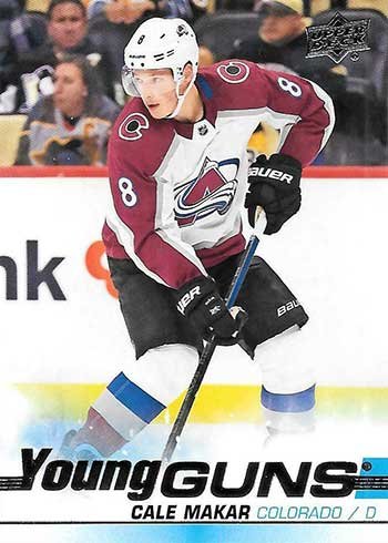
#5 2020/21 “To Boldly Go Where No Cardboard Has Gone Before…”
I love this series. This year is like oxygen. This design lifts us up where we belong! And other second hand Moulin Rogue references, I’m sure.
The lines are clean and coherent, with a The Preferred Space Design in the background. It’s smooth, and something you can actually look at and appreciate when its in your hand. And it will be, because the year is thick with excellent players! Lafreniere, Byram, Woll, I guess, why not. Seduce the Leaf Nation, Jason! Chase those readers! This is Robertson’s year, and Ottenger, so Dallas fans are going to be in deep. That Kaprizov fellow might turn into something one day too, I suspect.
This is absolutely a top 5 card, what would you even change?
#4 2017/18 “Almost Famous.”

I never realized it before, but this year is sort of a reverse 2018/19, setting the table for what was to come next. Modern full art meets retro border, what isn’t to like? A lot of the best designs have “Young” or “Guns” in a flowing silver script because it always looks so clean.
I don’t want every year to be a linear iteration on what came before – this isn’t Color Flow! – but it’s nice to see that UD can recognize what works, made some slight tweaks, then move on to the Next Hot Thing.
#3 2015/16 “The One That Mark Likes.”
Jason messaged me, eyes bleeding, begging me to take one year off his hands. When I saw the options he left, I passed on the chance to let him continue suffering and called dibs. How could I not? It’s the year of Connor! Seriously, there are three guys named Connor in Series One. And because of Edmonton I’ve got a snowball’s chance in hell of ever pulling a raw Hellebuyck from a pack because I don’t have fifteen hundred dollars for a hobby box. Oh shit, sorry, what do I think of the design?
Yeah, it’s solid. I do wish they’d gone a little heavier on the transparency of the grey bar, or better yet, done team colour matching, along the bottom because in dim light the foil all blends in and makes it hard to read. Otherwise, they are great full art cards with a nice, clean overlay. Jason’s ranked it just right.
#2 2016/17 “The #1 Pick Is A Leaf? MAKE EVERYTHING BLUE!”
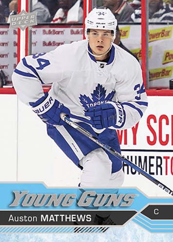
Despite the obvious pandering to Toronto fans, this is an incredible design. The way the blue bar gets thinner to the right and the slash marks sit below the nameplate always reminds me of clean flowing water. It takes me to my happy place.
Pulled out of my zen-like meditation, I remember how punchable Mathews’ face is. Happily I can avoid such turmoil by enjoying players such as Aho, Konecny, Hyman, and Laine instead.
Ugh, was this year Nylander as well? Marner? Exhausting. Still! Great designs made, one assumes, by great people. #blessed
#1 2018/19 “Somebody PLEASE! Get This Designer A Merit Increase.”
The perfect YG. 5 stars, no notes.
- The top left is full art, as all modern cards should be.
- The bottom right is a white bordered throwback to the glory cards of yesteryear.
- All the fonts are legible, the color palate is simple, and everything works together.
You’ll feel good every time you flip through your collection with nothing to distract you from appreciating your Dahlin, Pettersson, Svechnikov, or Tkachuk rookie cards. This design is an active participant in the hobby and your joy! Glorious.
What a List. Take That, Depression!
Writing a list like this when you’re bored and hate-watching random NHL games can be a very relaxing, even recharging experience. Which is weird when you realize that Quirky Lists make up 80% of a Buzzfeed writer’s billable hours and you have to think that office has a proven and effective series of anti-suicide nets on the roof.
I wouldn’t have realized this before ordering everything, but things got a lot more consistent 10-15 years ago. 2005-2015 was good when it was good but when it was bad it was the worst. Every truly wretched design was outside the last 10 years and that isn’t a coincidence.
Speaking for Mark, as I always do/can/will, we hope you find this review maliciously ignorant, the kind of impulsively confrontational argument bait usually reserved for 4chan. We’d love if you agreed! But the odds are against us. Let us know what you think, or where you think we went wrong. We promise not to to call you out on Instagram or Bluesky. We won’t write to your local elected officials.
Probably won’t.